
Created by
Kanishak Mahendiratta
Last Updated
Feb 20, 2025


How to use the scroll reveal image component
Copy the component link.
Paste the copied link onto your Framer Canvas.
The Scroll Reveal Image component will appear on your Canvas.
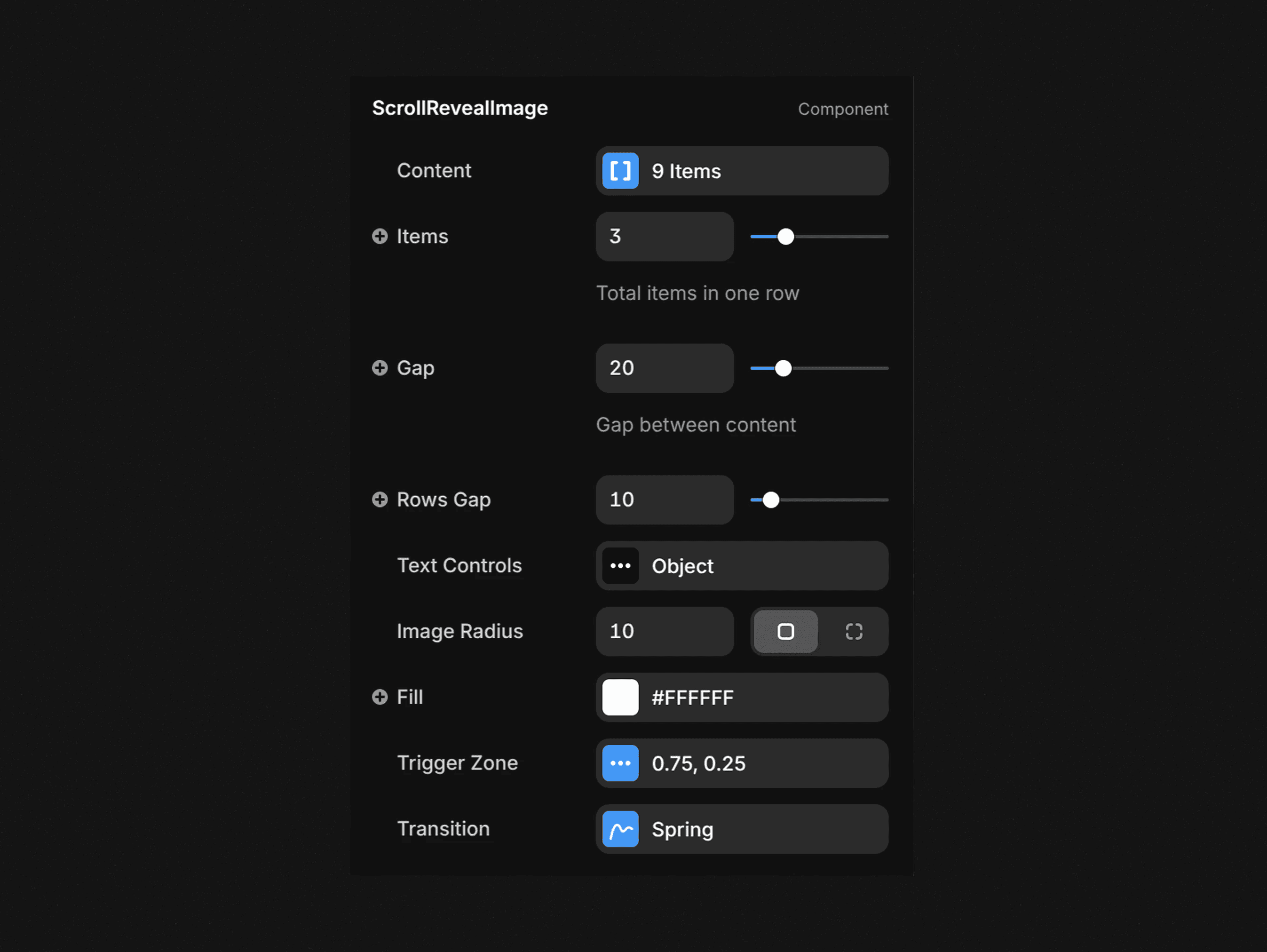
Customization Options (Right Sidebar)
Content Array: Create a mixed array of text and images
For each item, choose type "Text" or "Image"
For text items: Enter your text content
For image items: Upload or select an image and add alt text
Layout Settings:
Items: Set number of items per row (1-10, default: 3)
Gap: Set horizontal spacing between items (0-100px, default: 10px)
Rows Gap: Set vertical spacing between rows (0-100px, default: 10px)
Padding: Adjust padding around the entire component.
Style Settings:
Font: Choose font style, weight, size, and line height
Text Color: Set color for text elements
Image Radius: Adjust border radius for images (default: 10px)
Fill: Set background color for the component.
Trigger Zone Settings:
Starting Trigger: Control when animation begins (0-1, default: 0.75)
Value of 0.75 means: "Animation starts when the top edge of this element is 75% down the viewport height"
Ending Trigger: Control when animation completes (0-1, default: 0.25)
Value of 0.25 means: "Animation completes when the bottom edge of this element is 25% down the viewport height"
Transition: Configure animation properties for the image reveal effect
Preview your component by scrolling through your prototype to see how text fades in and images expand into view based on scroll position.
For optimal results, place this component in a scrollable frame and experiment with different trigger zone values and transition settings.